The Blue-and-Sand Colour Trap in Coastal Films
The blue-and-sand colour trap can make coastal films feel interchangeable. Build a more distinctive shoreline palette from local details, weather, and story.
The blue-and-sand colour trap can make two very different coastlines look like the same beach. A film set beside a working harbor, a marshy estuary, or a wind-scoured stretch of shingle feels more specific when its colors come from the place and the story, not just the water.
Color can tell viewers what a shoreline is used for and how a character experiences it. Look beyond the horizon: boat paint, tide-marked concrete, seaweed, shop awnings, and the clothes people wear all contribute. The challenge is deciding which details deserve to lead the frame.
Why does the blue-and-sand colour trap flatten a coast?
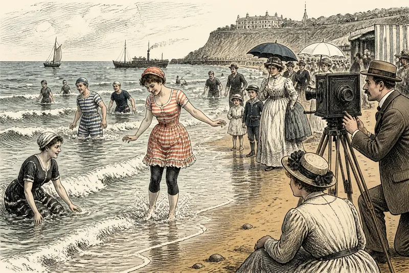
Blue water and pale sand quickly suggest sunshine, leisure, and open space. That shorthand suits some stories, but it can make a rocky inlet, an industrial port, and a crowded promenade feel interchangeable. It also risks promising a holiday mood when the film is about work, routine, or a strained relationship with home.
Blue still belongs in a coastal film when the scene calls for it. The more useful question is what shares the frame with the sea: rust on a mooring chain, green-black algae below a quay, a faded sign above a fish shop, or the warm square of light in a window on a gray evening.
Which local details make a coastal palette distinctive?
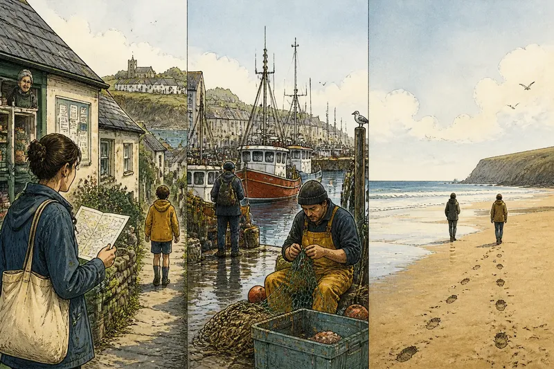
Start with surfaces viewers encounter at human scale. Check whether the location’s visual character comes from painted harbor sheds, brick terraces, pale stone, concrete steps, dune grass, or the weathered colors of boats and nets. These details can give a frame a sense of use and upkeep rather than postcard polish.
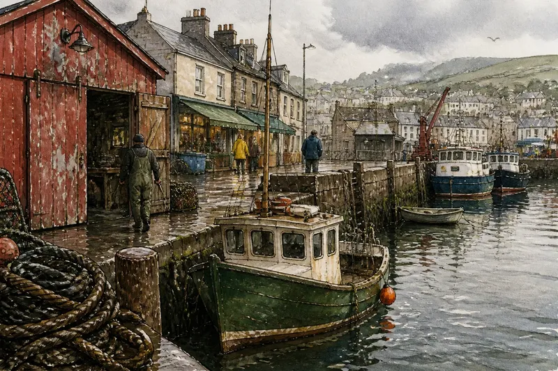
For a working port, separate the colors by their role. Dark rope and wet timber can anchor the lower frame; chipped red shed paint can draw the eye; a muted green hull can keep the water from becoming the only color cue. This is more revealing than assigning every exterior a bright blue background.
Say a fictional film is set in a small harbor where the director wants the town to feel inhabited, not staged for visitors. The art team starts with chipped red shed doors, dark rope, pale stone, and a green boat hull; it repeats those tones in a shop sign and a character’s work jacket, while leaving the sea subdued. The expected result is a harbor whose identity comes through its buildings and labor, even in shots where the water occupies little of the frame.
How should weather change the colors?
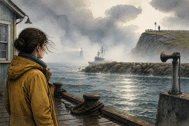
Weather can alter the same materials without changing the location. Low cloud can soften painted walls and make wet pavement reflect a shopfront; sharp sun can expose glare on the water and hard shadows under a pier. Mist may blur the edge between sea and sky, while wind can make clothing and grasses feel restless.
Let that shift serve the scene rather than assign a fixed emotion to each kind of weather. A gray sky need not drain every color: a vivid raincoat might become the scene’s focal point, or a warm interior may push against the cool view outside. Production design, wardrobe, and lighting should work with the planned color grade instead of expecting post-production to create a coherent place by itself.
When does a limited palette suit the story?
A limited palette uses a few colors to create a strong visual pattern or direct attention. A film might hold to dark surfaces, muted greens, and cool stone, then let one bright coat stand out because it belongs to a character or marks a change in the scene.
This approach can suit a story that feels enclosed, watchful, or unusually calm. It also comes with a trade-off: if every surface obeys the same scheme, a lived-in town can look designed down to the last detail. Keep a few unplanned colors in view—a faded awning, a patch of algae, or a sign sun-bleached at the edges—so the setting retains its variety.
Which coastal color questions come up most often?
How do I choose colors for a working harbor?
Look first at painted metal, wet rope, stained timber, and concrete, then choose which materials belong in the foreground. If labor and routine drive the story, let those surfaces shape the palette; if a particular character should stand out, reserve a contrasting color for their clothing or tools.
Should a stormy coast look gray?
No. Gray light can sit beside dark green water, vivid rainwear, or warm window light. If the scene feels visually flat, add contrast through one of those elements rather than making every color more saturated.
Can warm colors belong in a coastal film?
Yes. Rust, brick, weathered wood, and late sunlight can all belong to a shoreline. If warmth supports the scene, connect it to visible sources such as buildings, boats, clothing, or interior light rather than applying it uniformly.
How can a stylized palette still feel rooted in a real place?
Base the scheme on details that plausibly belong to the setting, such as local building materials, vegetation, harbor equipment, or clothing. If the colors feel too uniform, allow a few surfaces to fall outside the scheme so the frame keeps the irregularity of daily life.
How can you choose and check the palette?
Match the palette to the story’s main pressure, then check whether it can carry across a harbor, a road beside the water, and an interior near the shore. Those views do not need identical colors, but they should feel connected. Use these checks to decide what to keep or change:
- Check whether the most visible colors come from actual local materials; if they do, keep them as anchors, but if they come only from generic blue water and pale sand, add details from buildings, work, or plant life.
- Check whether a harbor prop such as rope, a net, or a boat hull reads clearly against its background; if it does, retain the contrast, but if it disappears, change the prop’s color or its position in the frame.
- Check whether the planned weather changes how the same surfaces read; if the shift supports the scene, let the light shape the palette, but if it makes the setting feel unrelated from shot to shot, carry a recurring material or color through the sequence.
- Check whether one accent color has a story reason, such as marking a character or a new development; if it does, reserve it for that purpose, but if it has no clear role, reduce its prominence or choose a more meaningful accent.
- Check whether the palette leaves visible variation in ordinary surfaces; if it does, keep those irregular colors, but if every wall, coat, and boat looks coordinated, loosen the scheme with an existing sign, awning, or patch of vegetation.
- Check whether the harbor, shore road, and nearby interior feel as though they belong to one place; if they do, carry the palette forward, but if one setting breaks away, repeat a local material or adjust its lighting and wardrobe colors.
The blue-and-sand colour trap is easiest to escape by asking what a frame would lose if the water’s blue disappeared. If the answer is “the whole identity of the place,” bring the town’s work, buildings, weather, and worn surfaces into the color story. A shoreline then becomes recognizable not just as a view of the sea, but as a place people inhabit.